What was the goal?
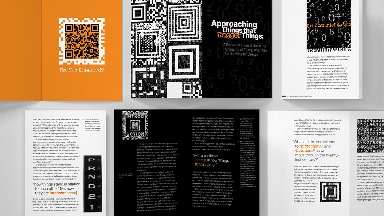
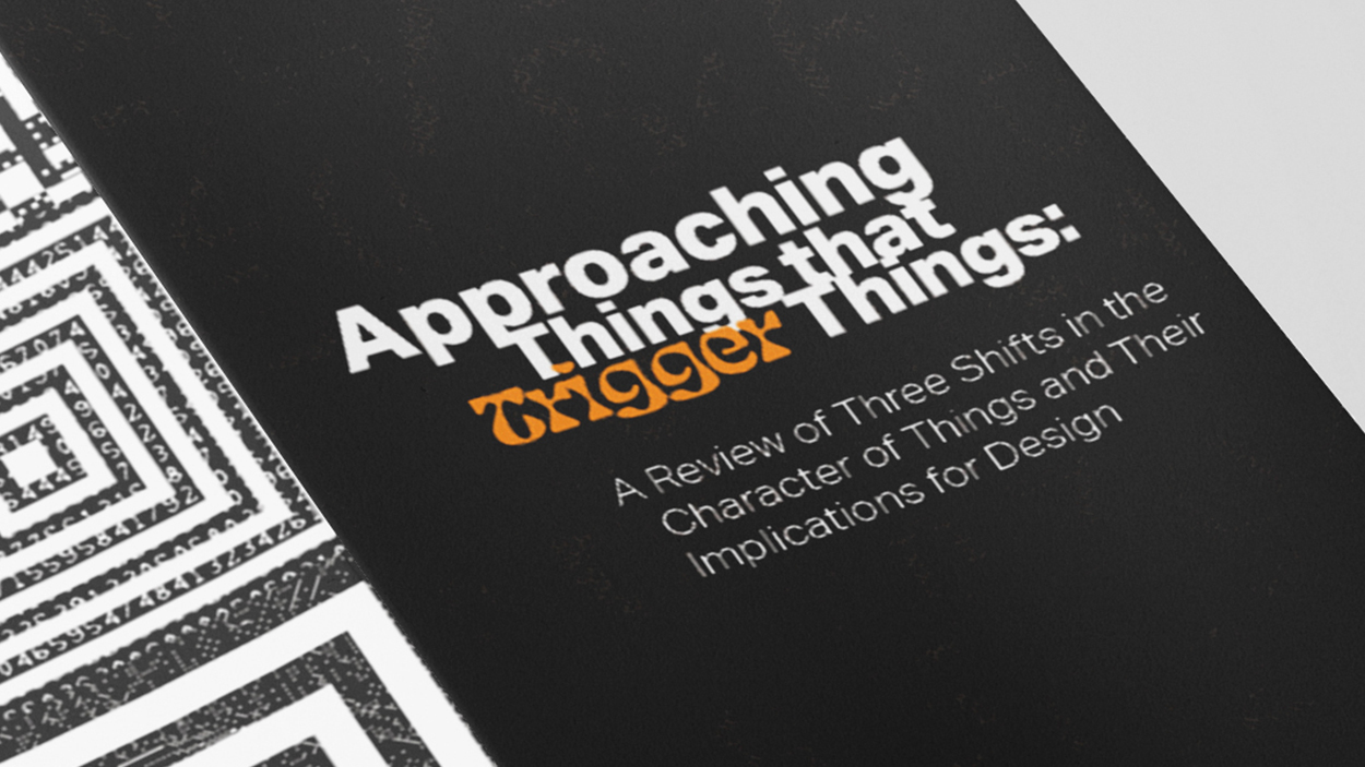
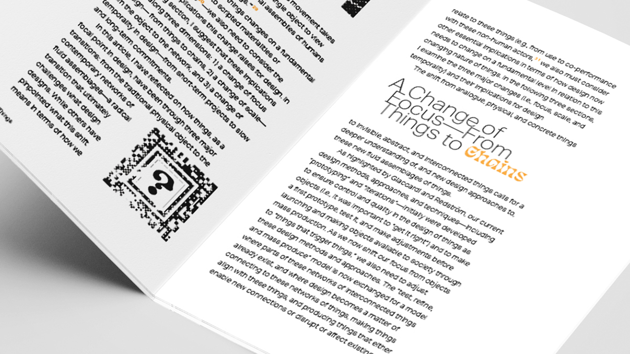
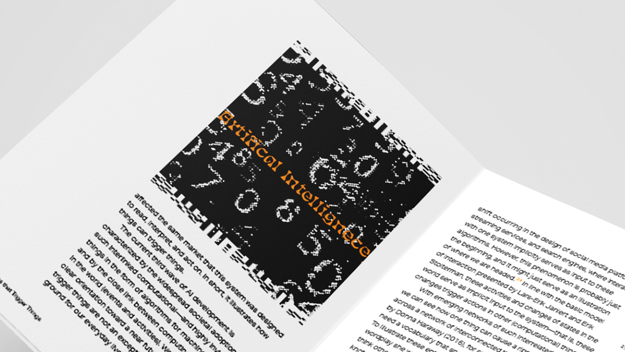
The mission was to re-typeset Mikael Wiberg’s Design Issues article (January 2, 2022) into a compact, standalone booklet. Including footnotes and contextual explanations—into a smaller format without sacrificing clarity or readability. The goal was to maintain the reader’s engagement while ensuring the information remained accessible and thoughtfully organized.
In the end, sourcing a print shop and getting the booklet files finalized and checked for print.
What I learned?
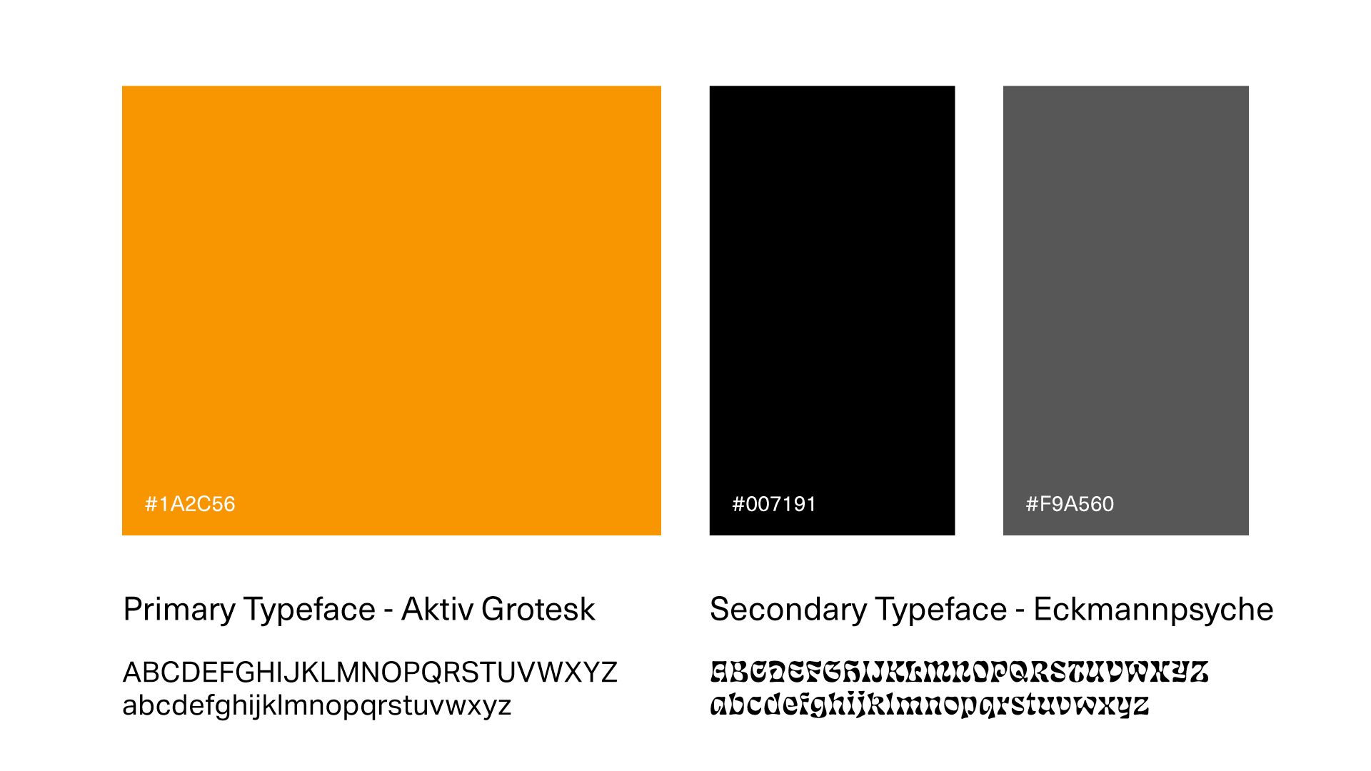
The challenge of organizing type in the booklet involved carefully experimenting with various placements to establish a clear hierarchy and readability. This process included conducting thorough readability tests to determine the optimal type sizes and weights that ensured clarity across different sections.
Additionally, working closely with the print shop required effective communication to resolve proofing issues and ensure the final printed booklet met quality standards. Throughout the project, maintaining consistent typography, space, and proper alignment was crucial for creating an accessible design.